THE NEW NEUTRALS. WHY WARMTH HAS REPLACED GRAY.
Gray once reigned. For a decade it painted every wall, promised a clean slate, and flattened every room it touched. What felt fresh in 2010 now feels lifeless. Today, the neutrals reshaping design are not cold or clinical. They are warm, layered, and alive. Mushroom, taupe, and stone are replacing cool gray. Texture now matters as much as color. This is the new language of timeless design.
1. The Fall of Cool Gray
Cool gray is no longer a blank canvas. It is a timestamp. It ties a room to the last decade, when every space looked the same. Against stark trim and brushed nickel, gray flattens light and drains warmth. What once felt modern now feels one note.
2. The Return of Warmth
Warm neutral paint colors shift the mood entirely. Taupe, mushroom, and sand carry undertones that echo stone, clay, and earth. They read calm, but never dull. They anchor a room while leaving space for texture, art, and life to breathe.
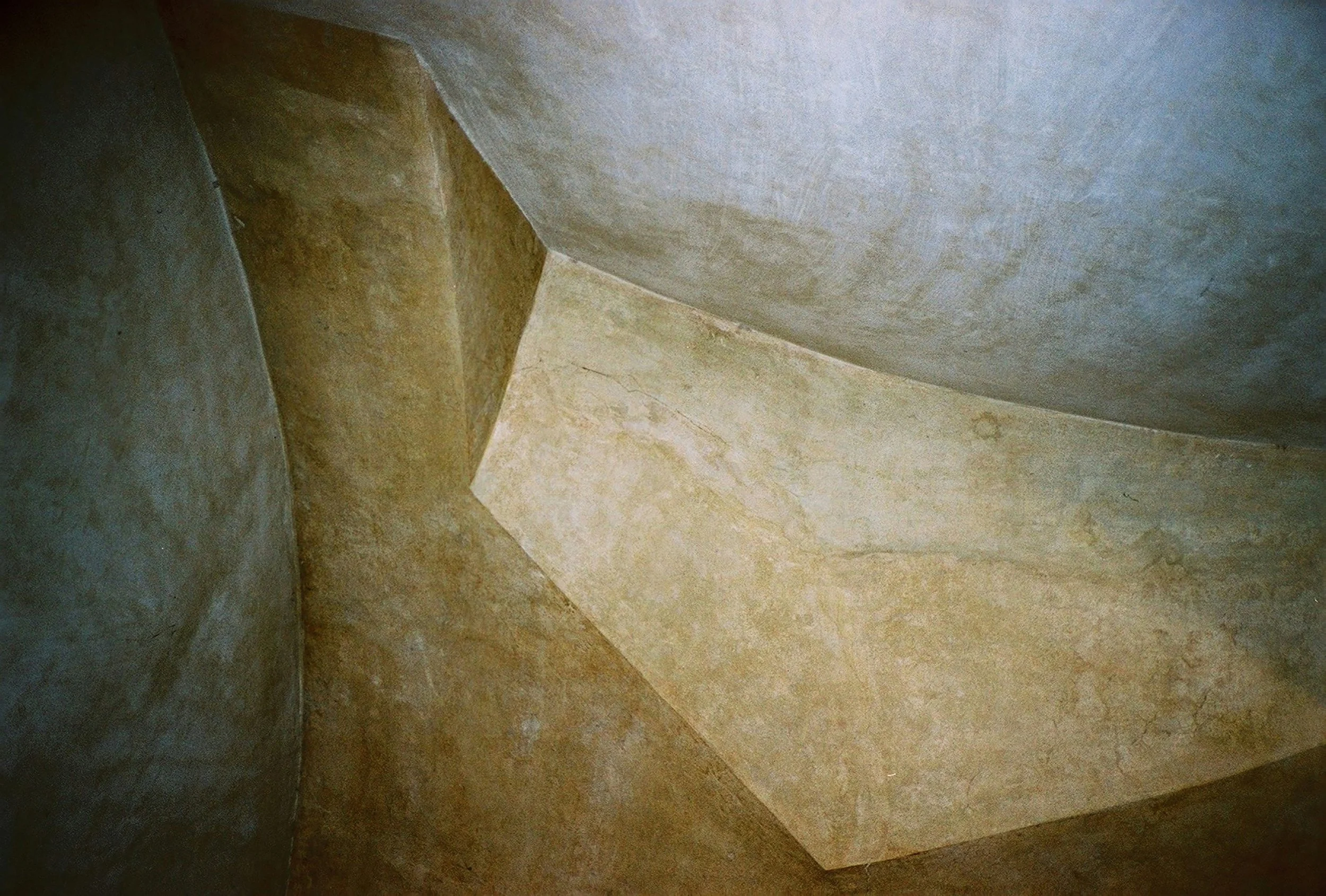
3. Texture Takes Over
Paint alone cannot hold a room. The new neutrals come alive with limewash, plaster, and raw wood. Shadows catch on uneven surfaces. Walls move with daylight. What might look like beige on a paint chip becomes atmosphere once layered with texture.
4. When Bold Turns Heavy
Tuscan gold and burgundy once promised drama. Today they weigh a room down. Their modern counterparts still offer richness, but with restraint. Buttery creams bring sunlight without glare. Earthy reds lean into warmth without swallowing the space.
5. Timelessness Is Subtle
The most enduring colors are rarely loud. They shift with light, adapt to materials, and create harmony. Warm neutrals make a room feel timeless not because they disappear, but because they let everything else take its place.
By 2026, warm neutrals will not be seen as a trend. They will feel inevitable.
By Lauren Saab, Founder of Saab Studios